Advertising design, copywriting & tagline creation
Advertising design, copywriting & tagline creation
Project Management
SCRUM Master
Lead Product Design
UX Research | UX & UI Design
MSOneRm - One Client Relationship
OneRm is next-generation marketing automation platform leveraging both subscription and consumer usage data in a real-time event-based environment.


Improved marketing targeting accuracy by an understanding of the "Vibe" and language use in coffee shops?

About
Austin, Texas has always been known as a place where trends are set and those we consider “weird” set them. Some trends evolve into new trends ideas and become some of the coolest parts of our Americana lifestyle. Coffee is no slouch when it comes to cool. Coffee is arguably one of the largest pastimes in the U.S. Expanding our understanding of how we talk about coffee and what we considered to be hip, cool, and in vogue in the subculture, and its niche communities across the nation is one way to approach a qualitative understanding/investigation of coffee (the product) and our relationship to what is driving its popularity in our culture.
The Exercise
In this exercise, I searched for a data set online. The dataset was downloaded from data.world. I specifically was searching for a dataset surrounding the genre of coffee and consumer sentiment. I found it. Interestingly enough I discovered a dataset that was quite deep, over 7k rows of data. It’s also descriptive. This data set is one researcher's observations over a 3 year period of time and covers 70 coffee shops in Austin Texas. The observations are spaced out by 2 - 3 months. For example, over the course of three years from 2013 to the end of 2016, The Steeping Room, a local coffee shop in Austin, was observed more than 100 times.
So what can we do with this data and what might we learn?
What might an original and fun approach to UI/UX look like to support marketers?
Hypothesis
1. Can phrase be extracted from paragraphs into one data set? Can those phrases be separated by Nouns, verbs, and adjectives?
2. Can the customer sentiment scores around parking, seating, food, and coffee be correlated to the phases?
3. Might pattern exist found in the data that might lead to improved marketing targeting accuracy? Might we understand the "Vibe" of Austin coffee shops better via the use of language evolving in Austin TX?

Shop Observation
The Factory - "Cafe With a Soul"
11/10/2016
3 check-ins were performed
"This place has been shown on my social media for days so I finally visited! One of THE cutest and "vibeistic" looking coffee shops I have ever visited. You can self-order which is nice because you can take your time and look at the pictures to help you decide! I especially liked how pictures were shown so I knew which coffee/tea came out aesthetically."
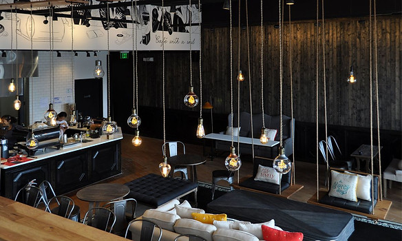
"I ordered the famous matcha green coffee and i don't usually drink coffee but it went beyond my expectations. They give you a good amount and its creamy and sweet. The only downside is no internet. So hard to study here. Matcha green tea and "living la vida coffee Matcha green tea coffee".
See all photos from Sarah L. for The Factory - Cafe With a Soul
The Data Sets
There are several data sets to pull from.
1. Raw Yelp Reviews and the 5-star ratings
2. The Sentiments by Shop and the observations


The Sentiments by shop
Total Shop Observations - 7618 Check-Ins
Total Shops: ?
By example, over the course of three years from 2013 to the end of 2016, the steeping room, a local coffee shop in Austin Texas was observed more than 100 times.

What might be learned from simple conditional formatting?
-
Simple conditional formatting using excels ability to create custom rules uncovered some basic assumptions relating to the 1 to 5-star rating the Observer placed during the check-in on the coffee shop. By setting up a series of rules specific to phrases during the observation that were notated, such as good, bad, fantastic, intriguing, Vibistic, Etc. It's easy to quickly see simply by color coding the cells of the row that there are some repeated patterns in terms of phrases used to describe different types of experiences.
As expected, multiple uses of specific phrases across such a long period of time and across 70 coffee shops produce numerical results that are congruent to an assumption regarding the use of phrases in correlation to be five-star rating the research observer has placed.
* Phrase totals have not yet been produced.


What might be learned from importing the data to RAW? https://rawgraphs.io/
-
Circular Dendrogram - Hierarchy
RAW What is used as a simple way to begin some exploration into pattern identification. Circular Dendrogram was explored first.
-
Next was a Circle Packing Chart that showed the shop in relation to the rating from 1-5 stars. Next was a more complicated Alluvial diagram.
-
Alluvial diagrams allow to represent flows and to see correlations between categorical dimensions, visually linking to the number of elements sharing the same categories. It is useful to see the evolution of cluster (such as the number of people belonging to a specific group). It can also be used to represent bipartite graphs, using each node group as dimensions.
In this Alluvial diagram, Shop, Rating, Price, Vibe, Seating, and Parking scores were considered.


Basic and expected data was produced.
Might there be a better solution?
Might a custom dashboard designed to be interactive rather than static produce a result that can be interpreted more accurately and produce patterns allowing an analyst to make connections between phrases and observation occurrences? Might this correlated to specific coffee shops to produce evidence that may assist marketers and how they target customers?.

Design Iterations
Rough Draft hand Sketch 001
The initial concept with sketch # 1. was intended to find Direct correlations visually between the coffee shops, their ratings by The Observer, and the correlation between popular phrases during The Observers review. To the right of the coffee filter, phrases have been extracted to show visual understanding to the analysts so that they can understand possible indications of patterns such as words like parking or service.
Rough Draft hand Sketch 002
In sketch # 2., I drew a custom interface dashboard as I'm starting to think about using an interactive dimensional disc as a way to rotate from coffee shop to coffee shop and click on them independently.
When clicked on, phrases from specific reviews are then highlighted via an Alluvial diagram style interface. Additionally, at the bottom, I've indicated a show similar switch that can be turned on that shows similar coffee shops with similar ratings that match to exact phrase matches and filtered to specific values.
This feature is designed to allow an analyst to find the similarities between two separate data sets and potentially allow for further investigation into other coffee shops to understand why some groups of people may prefer certain types of coffee shops over others.


Breakdown of the sketch
The initial concept with sketch # 1. was intended to find Direct correlations visually between the coffee shops, their ratings by The Observer, and the correlation between popular phrases during The Observers review. To the right of the coffee filter, phrases have been extracted to show visual understanding to the analysts so that they can understand possible indications of patterns such as words like parking or service.
In Conclusion
In conclusion, an Alluvial diagram style interface was created to simply show coffee shops that were similar to each other and filterable by location, rating, and capable of parsing phases as well as other aspects of data. In this way, marketers could use the tool to load datasets and visualize the shops easily and the data that supported their similarities in a delightful manner.

To the left, the user has chosen a coffee shop in the UI to inspect.
The "show similar" affordance was activated and the user is able to see quickly other shops that reflect similar qualities and descriptors to the one they selected.

In this example, the user selected a coffee shop on the left of the interface and below that coffee shop, similar shops are highlighted.
However, on the right the user can see quickly the Alluvial diagram style UI is surfacing phases and data that classify the coffee shop in the data-set. The idea is that the similar shops highlighted share these data points/phases.
For instance, all three coffee shops share the phrase "Love it!" This finding allows marketers to cross-reference quickly without having the deal with monotonous data tables and spreadsheets and an alternative UX solution.
In Conclusion
In conclusion, an Alluvial diagram style interface was created to simply show coffee shops that were similar to each other and filterable by location, rating, and capable of parsing phases as well as other aspects of data. In this way, marketers could use the tool to load datasets and visualize the shops easily and the data that supported their similarities in a delightful manner.

